Edit a Tab button
After you add a new tab, you can edit the settings.
For information on adding a new tab, see Add and remove tabs.
- From the menu, select Mobile Apps.
- Select a channel.
- From the Mobile App Explorer, select a tab (folder).
-
Select the Edit Tab button
-
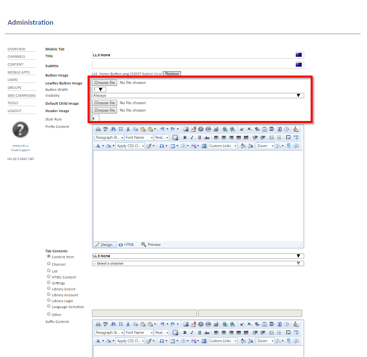
In the Mobile Tab section, enter a title.
-
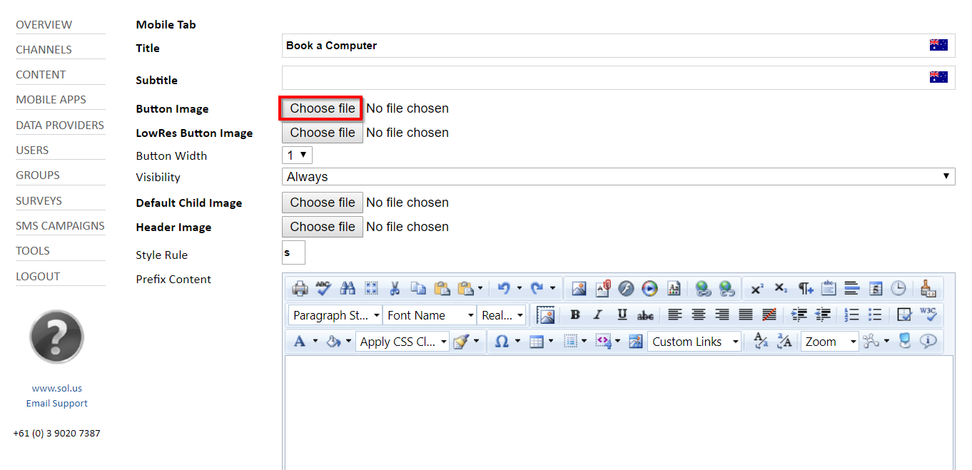
In the Button Image section, select Choose file.
This field contains the name of the button image after the image is uploaded.
- Find and select an image for the button.
The Tab Details page opens.
This is the name the CMS will use as an identifier for the tab.
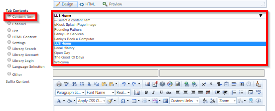
- In the Tab Contents section, select from the available options.
- Content Item—use the content item to configure a button to open a single item such as a live webpage or a single image.
- Select Content Item, and then select an item from the list.
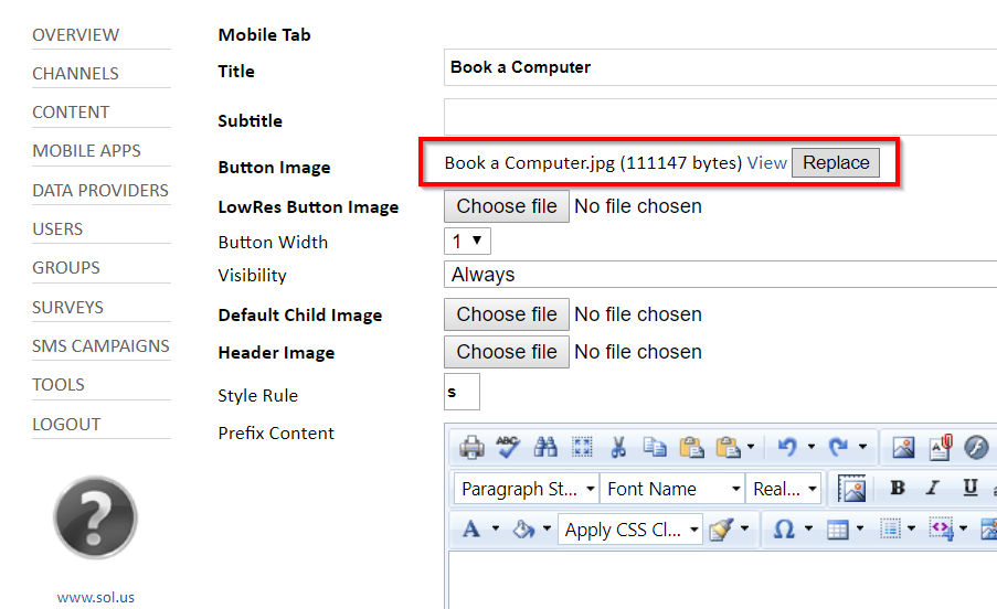
If you want to change the button image, select Replace.
Tab contents consist of various content types, but the two that will be most commonly used for tab setup or maintenance are:
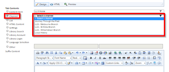
- Channel—use the channel option when you have created a channel for a data set typically consisting of a set of images or branch details.
- Select Channel, and then select a channel from the list.
- Select Channel, and then select a channel from the list.
The following table lists the tab type options:
| Content Type | Description |
| Content Item | Use this type of tab to link to a content item previously created in the admin system. These content items are webpages for online resources, videos, PowerPoint presentations, and so on. |
| Channel | Use this type to link a button to a single channel under your control. The channel can be used to display a variety of content. In addition to containing a schedule of content, a channel can have location information attached to it (for example, to specify a location such as a branch or facility). |
| List | List of channels (multi-select from the list of all channels). Use this type to power the “Find my nearest X” section of the app. In addition, this type is used for tabs that contain subtabs. For example, an Online Resources tab that contains subcategories, which then contains an individual tab for each online resource. Each of those tabs can then be a “content item” type linking to a URL content item. |
| HTML Content | Use this type to provide a space to write your own freeform HTML content to be displayed when a user selects this tab. |
| Settings (built-in) | Use this built-in tab type to set this tab to display the login/logout options along with connecting to other log in providers (for example, Facebook). |
Library Search (built-in) | Use this built-in tab type to set this tab to display the LMS search page to perform catalog queries for your subscribed LMS instance. |
| Library Account (built-in) | Use this built-in tab type to set this tab to display the user's account information. In a library context, this will include checkouts, holds, and fees/fines. |
-
The following fields are optional and can be left with their default values:
-
Subtitle
-
Low Res Button Image
-
Button Width
-
Visibility
-
Default Child Image
-
Header Image
-
Style
-
- If desired,
enter content in the Prefix Content and Suffix Content sections.
The Prefix Content and Suffix Content options allow you to specify free-form text (or HTML content) at the top and bottom of the tab page respectively. This doesn't apply to the built-in content types.
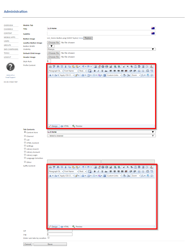
- Select Save.